Color Psychology's Role in Commercial Painting Projects

Revive Painting • June 7, 2024
commercial painting projects

In the bustling world of commerce, every detail counts. From the building's exterior to the smallest color accent, each element plays a vital role in shaping the overall impression and experience for customers and employees alike. Among these considerations, color psychology stands out as a powerful tool for commercial painting projects. Understanding how different colors influence emotions, perceptions, and behaviors can significantly impact brand identity, mood, productivity, and even spatial perception. In this article, we delve into the multifaceted role of color psychology in commercial painting, exploring its implications across various aspects of business environments.


Brand Identity


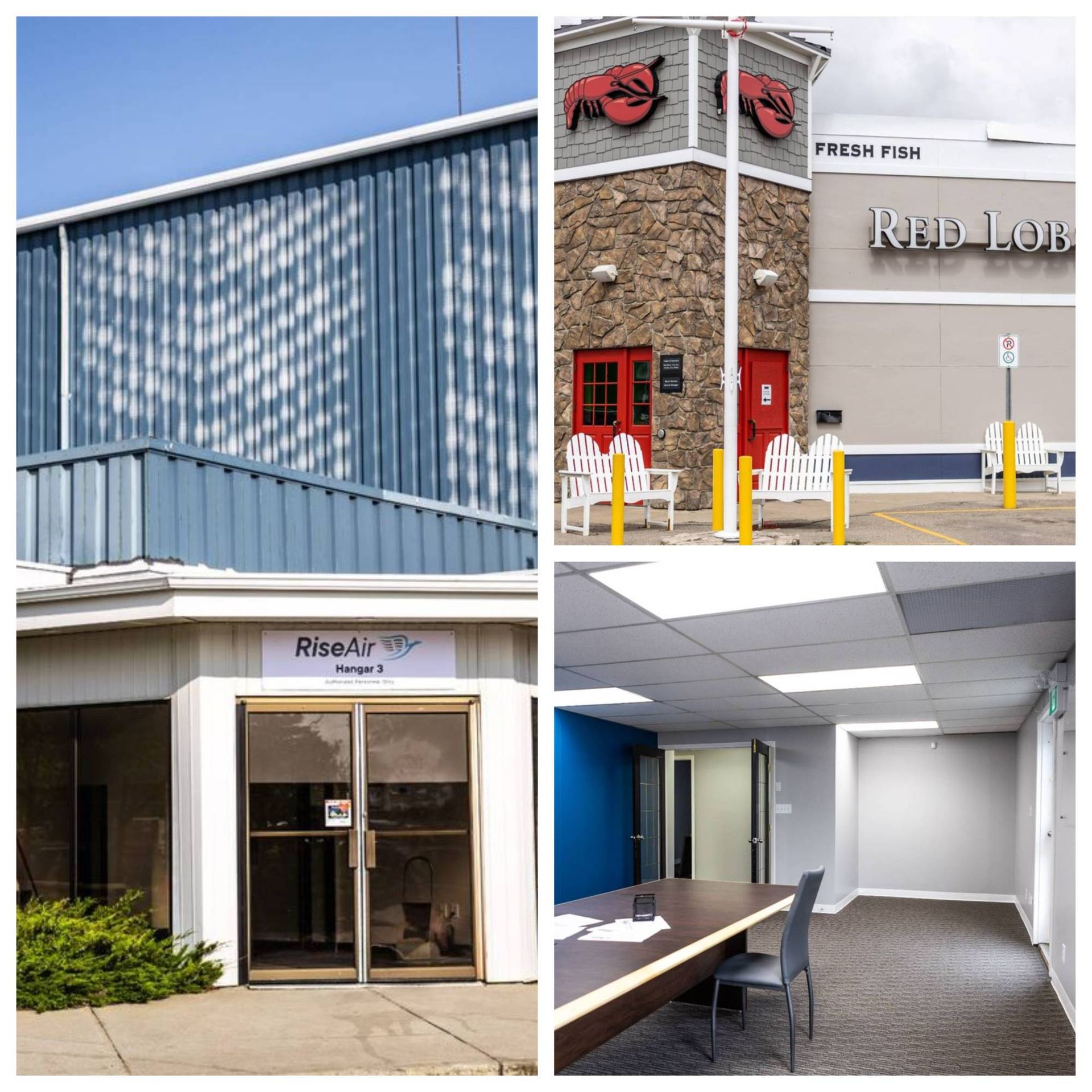
The colors chosen for a commercial building's exterior can speak volumes about the brand it represents. Whether bold and vibrant or understated and elegant, the selected palette should align seamlessly with the company's values, personality, and target audience. For example, a tech startup might opt for sleek, modern tones like charcoal gray and electric blue to convey innovation and sophistication. Conversely, a family-owned cafe might embrace warmer hues like earthy browns and cheerful yellows to evoke a cozy, welcoming atmosphere. By strategically leveraging color, businesses can reinforce their brand identity and leave a lasting impression on passersby and potential customers.


When it comes to interior spaces, color plays an equally crucial role in shaping brand perception. From office lobbies to retail showrooms, the colors adorning the walls can set the tone for the entire customer experience. For instance, a healthcare clinic might utilize calming blues and greens to instill a sense of tranquility and trust, while a high-end fashion boutique might opt for bold, statement-making colors to exude luxury and exclusivity. By aligning interior color schemes with brand values and customer expectations, businesses can create cohesive, memorable environments that enhance brand recognition and loyalty.


Mood Influence


The psychological impact of color on mood is well-documented, with certain hues eliciting specific emotional responses. For instance, warm colors like red, orange, and yellow are often associated with energy, optimism, and warmth, making them ideal for spaces where creativity and productivity are paramount. In contrast, cool tones such as blue, green, and purple tend to evoke feelings of calmness, serenity, and focus, making them well-suited for environments where relaxation and concentration are desired. By strategically incorporating these mood-enhancing colors into commercial spaces, businesses can create environments that promote desired emotional states among occupants, whether it's invigorating energy in a bustling office or fostering tranquility in a spa retreat.


Spatial Perception


The strategic use of color can also influence how we perceive space, altering our sense of scale, depth, and dimension within a given environment. For example, lighter colors like whites and pastels tend to make spaces feel larger and more expansive, making them ideal for small rooms or areas with low ceilings. Conversely, darker hues like blacks and deep browns can create a sense of intimacy and coziness, making them well-suited for larger, open spaces that need to feel more inviting and intimate. By carefully selecting and deploying colors based on spatial considerations, commercial painters can effectively manipulate perception to enhance the functionality and aesthetics of various environments.


Wayfinding


In busy commercial settings such as shopping malls, airports, and office complexes, effective wayfinding is essential for guiding visitors and occupants through the space with ease and clarity. Color plays a vital role in this process, with distinct hues and patterns serving as visual cues to indicate direction, highlight points of interest, and differentiate between areas or zones. For example, bright, contrasting colors might be used to mark entrances, exits, and emergency exits, while subtle variations in shade or tone could denote changes in floor levels or building sections. By leveraging color as a wayfinding tool, businesses can improve navigation, reduce confusion, and enhance the overall user experience for visitors and employees alike.


Productivity Impact


The colors surrounding us can have a profound impact on our cognitive function, creativity, and productivity levels. Research has shown that certain colors can stimulate brain activity, enhance focus, and even boost motivation and morale in work environments. For example, shades of blue have been found to promote concentration and mental clarity, making them well-suited for office spaces where productivity is paramount. Similarly, accents of green can evoke feelings of harmony and balance, fostering a sense of well-being and creativity among employees. By strategically incorporating these productivity-boosting colors into commercial painting projects, businesses can create workspaces that optimize performance and foster a positive, collaborative atmosphere.


Target Audience Appeal


In the competitive landscape of business, understanding and appealing to the preferences of target audiences is key to success. Color psychology offers valuable insights into the preferences, emotions, and behaviors of different demographic groups, allowing businesses to tailor their environments accordingly. For instance, studies have shown that men and women tend to have different color preferences, with men gravitating towards bold, primary colors and women favoring softer, more pastel hues. By considering the demographics and psychographics of their target audience, businesses can select colors that resonate with their preferences and create environments that feel welcoming, inclusive, and visually appealing.


Lighting Interaction


The interplay between color and lighting is a critical consideration in commercial painting projects, as lighting conditions can dramatically alter the appearance and perception of color within a space. Natural light, artificial light sources, and the positioning of light fixtures can all influence how colors are perceived, from brightness and intensity to hue and saturation. For example, warm, incandescent lighting may enhance the richness and warmth of earthy tones, while cool, fluorescent lighting may cast a bluish tint on lighter colors. By carefully coordinating color palettes with lighting design, businesses can ensure consistency and harmony in their commercial environments, creating visually pleasing spaces that look and feel inviting under any lighting conditions.


Emotional Response


Last but certainly not least, color can evoke powerful emotional responses that shape our perceptions and experiences within a space. Whether consciously or subconsciously, colors can trigger associations, memories, and moods that influence our behavior and decision-making. For example, the color red is often associated with passion, excitement, and urgency, making it a popular choice for stimulating appetites and encouraging impulse purchases in restaurants and retail settings. Conversely, softer shades of blue and green are linked to feelings of calmness and relaxation, making them ideal for healthcare facilities and wellness centers. By understanding the emotional connotations of different colors, businesses can harness their power to create environments that resonate with customers on a visceral level, forging deeper connections and fostering positive experiences that keep them coming back for more.


Unlock the Power of Color: Transform Your Commercial Space with Revive Painting Today!


Ready to transform your commercial building's exterior with the power of color psychology? Let Revive Painting be your partner in creating a space that not only reflects your brand identity but also influences mood, enhances spatial perception, and engages your target audience. Our expert team understands the nuances of color and its impact on commercial spaces, and we're here to bring your vision to life. Whether you're looking to refresh your storefront, revamp your office interiors, or create a welcoming atmosphere for your customers, we've got you covered. Contact us today to learn more about our commercial painting services and start your project journey with Revive Painting.


exterior apartment painting services
By Revive Painting March 25, 2025
Most homeowners don’t think about paint until they see peeling, cracking, or sun-faded siding. But keeping your home in good shape isn’t just about quick fixes—it’s about regular care. Paint does a lot more than add color; it protects, preserves, and even improves the feel of your space inside and out. Painting for Home Preservation Your home’s exterior faces the weather head-on, every day of the year. Rain, wind, sun, and temperature swings all wear down materials over time. Paint acts as a barrier between your house and the elements, shielding wood, stucco, and siding from moisture and UV damage. When you apply a quality paint layer, you’re not just decorating—you’re preserving the bones of your home. Paint also slows natural wear. Without it, surfaces crack, rot, and absorb moisture more easily. If you’ve ever had to replace siding because of wood rot or moisture damage, you know how costly that can be. A strong paint job, refreshed at the right time, is your first line of defense—and far more affordable than structural repairs. Home Value and Paint Maintenance Curb appeal isn’t just a buzzword. Buyers notice the outside of your home first, and a fresh coat of paint tells them the property is well cared for. It doesn’t have to be trendy or bold—even a simple, clean look can boost value. A home with a fresh, thoughtful exterior paint colour feels inviting and more move-in ready to potential buyers. Inside, paint also plays a role in how a home is perceived. Neutral colors, crisp edges, and clean walls all make a space feel newer and brighter. A well-maintained interior shows that the homeowners took pride in upkeep, which can support a higher asking price when it’s time to sell. Investing in paint now could mean thousands more later. The Cost of Neglecting Exterior Paint Skipping maintenance might save money in the short term, but it almost always leads to more expensive problems later. When paint fails, it exposes surfaces to moisture and pests. That means wood can swell, crack, or even become a feast for termites—especially around windows and trim. Even if the damage isn’t obvious at first, it builds over time. What starts as small bubbling paint or hairline cracks could eventually require complete surface repairs or replacements. Paying for a good exterior painting job every 5 to 10 years is far less painful than major exterior renovations caused by avoidable neglect. Exterior Paint: Protection and Beauty It’s easy to think of paint as decoration, but it’s working behind the scenes too. A properly applied coat seals surfaces from rain, snow, and sun. This seal keeps your home insulated and dry, reducing the risk of water damage or mold growth. That added protection helps everything last longer, from the siding to the structure underneath. Of course, beauty matters too. A fresh exterior paint colour can transform the look of your home and even change how you feel about it. Whether you go bold or stay classic, paint refreshes the whole personality of your house. Plus, it can highlight details that add charm—like shutters, trim, and porch rails that often go unnoticed until they’re newly painted. Interior Paint: Health and Aesthetics Inside the house, paint does more than set the vibe. It can actually help create a healthier environment. Low-VOC and non-toxic paints reduce air pollutants, especially during and after application. In areas like kitchens and bathrooms, paint designed to resist mildew helps protect against dampness that could otherwise lead to health issues. Then there’s the visual lift. Clean, well-painted walls brighten a room instantly. Over time, scuffs, fingerprints, and fading can make a space feel tired. Updating a room’s paint brings it back to life—without needing a full renovation. Whether it’s a cozy bedroom or a family gathering space, the right colors make a big difference in how your home feels day to day. Signs Your Home Needs a Exterior Paint Job Your house doesn’t usually shout when it needs new paint—but it does drop hints. Look for peeling, cracking, or faded areas on the siding or trim. Bubbling paint or exposed wood are signs the protective layer has broken down. If you spot any of these, your home is due for a fresh coat. Color fading is another subtle cue. If your once-vibrant exterior paint colour now looks washed out, sun exposure has likely taken its toll. Also, keep an eye out for gaps around windows or doors, where caulk may have dried out and cracked. A full inspection every year or two will help you stay ahead of bigger issues. Seasonal Painting Considerations Timing your painting project matters more than you’d think. Spring and fall usually offer the best conditions—mild temperatures, lower humidity, and less chance of rain. Extreme heat or cold can affect how paint adheres and dries, which means choosing the right season is just as important as choosing the right color. That said, different climates pose different challenges. In humid areas, moisture control is key. In hotter regions, UV-resistant paint can help combat fading. Planning your exterior painting around your local weather patterns gives your paint job the best chance to last longer and look better. Long-Term Benefits of Regular Exterior Painting When you stay on top of painting, you’re investing in your home’s long-term well-being. Regular maintenance keeps surfaces sealed and protected, which prevents rot, mold, and other damage from setting in. It also gives you a chance to inspect for other issues before they get worse—like a cracked board or loose siding panel. Over time, consistent upkeep adds up. Your home looks better, lasts longer, and costs less to maintain. Plus, you won’t have to scramble for expensive fixes when it’s time to sell. A routine schedule of exterior painting every few years is one of the smartest, simplest ways to protect your investment. Protect, Transform, and Add Value to Your Home with Revive Painting Keeping your home looking beautiful and well-protected doesn’t have to be overwhelming or expensive. Whether your walls need a refresh, your trim is peeling, or you just want to give your space new life, Revive Painting is here to help. We take the hassle out of painting with skilled, reliable service and a commitment to getting it done right the first time. Don't wait until you see cracks or fading—get ahead of the damage and fall in love with your home again. From choosing the perfect exterior paint colour to adding crisp lines indoors, our team handles every detail with care. Contact us today, and let’s bring out the best in your home, one coat at a time.
exterior painted house blue shade
By Revive Painting March 17, 2025
Choosing the right paint colour for your home’s exterior can feel overwhelming. With so many options, it’s easy to stick with the usual shades. But stepping outside the box can make your home stand out in all the right ways. Whether you want something timeless, bold, or unexpected, exploring fresh exterior paint choices can give your home a whole new look. Little-Known Exterior Paint Colours That Boost Your Home’s Charm Not every home needs to be painted in white, beige, or gray to look stunning. Some of the most charming homes feature lesser-known hues like muted blues, soft yellows, and warm sage greens. These colours create a welcoming atmosphere while still feeling unique. A dusty blue, for example, adds a coastal vibe without being overpowering, and soft yellow makes a house look bright without being too flashy. When combined with crisp white trim, these shades bring an effortless charm to any home. Earthy reds and deep browns are also underused yet striking choices. A rich terracotta or a warm cedar brown can give a home a cozy, inviting feel while complementing natural surroundings. These colours work especially well for homes with brick or wood exteriors, enhancing their texture and depth. Instead of opting for the usual neutrals, a little creativity with these lesser-known hues can boost a home’s character in surprising ways. Timeless Neutrals That Make Exterior Painting Worth the Investment Neutral colours have long been a safe choice, but that doesn’t mean they have to be boring. Soft greiges, creamy off-whites, and gentle taupes create a sophisticated look that never goes out of style. Unlike stark whites, which can feel too bright under direct sunlight, warmer neutrals provide a balanced, classic appearance. These shades also work well with almost any architectural style, from modern to traditional. Investing in neutral tones is a smart choice for homeowners planning to sell. These colours appeal to a wide range of buyers and make homes feel fresh and well-maintained. A well-executed exterior painting project in a timeless shade can instantly elevate curb appeal and even increase property value. Plus, these colours pair beautifully with bold front doors, shutters, or landscaping features, making the entire exterior feel well-coordinated. Vintage-Inspired Exterior Painting Palettes Making a Comeback Old-fashioned colour schemes are finding their way back into modern homes. Soft pastels, such as light mint or powder blue, were once popular in the mid-20th century and are making a stylish return. These delicate shades add a nostalgic touch while maintaining a fresh and cheerful look. Paired with white trim and classic shutters, they offer an effortlessly timeless feel. Deeper vintage hues like burnt orange, mustard yellow, and muted burgundy are also regaining popularity. These colours were common on Victorian and Craftsman-style homes and still hold their charm today. They provide warmth and richness, making a home feel well-rooted in its history. Whether using a full vintage-inspired palette or just a single retro accent, these colours give a home a distinct and memorable personality. Expert-Approved Exterior Paint Colours for Modern Curb Appeal Designers often recommend colours that balance current trends with lasting appeal. Soft charcoal, deep olive, and stormy blue have become go-to choices for creating a sleek yet inviting exterior. These colours provide a contemporary look while still feeling warm and welcoming. They pair well with natural wood accents, metal fixtures, and minimalist landscaping, giving a home a refined aesthetic. For a softer modern approach, warm whites and pale grays remain top recommendations. Unlike traditional cool grays, which can sometimes feel cold, warmer variations create a cozier exterior. Paired with black or bronze accents, they achieve a polished yet livable curb appeal. Experts emphasize that modern exteriors don’t have to be flashy—sometimes, a well-balanced and thoughtfully chosen neutral makes the biggest impact. Unexpected Exterior Colour Combinations That Turn Heads Some of the most eye-catching homes feature unexpected colour pairings. Dark exteriors with bright, colorful doors—such as a charcoal house with a vibrant teal door—create a playful contrast that draws attention. Similarly, pairing muted sage green with burnt orange accents gives a home a warm yet unique look. These combinations add personality while maintaining a polished feel. Another bold choice is mixing contrasting neutrals, like soft beige with deep navy trim. This mix creates depth and interest without feeling overwhelming. Even subtler pairings, such as warm gray with deep burgundy shutters, can give a home an elegant, refined look. Instead of sticking with predictable palettes, unexpected combinations can make a home stand out in the best way possible. Classic Exterior Painting Choices That Outlast Trends Some colours have remained popular for decades, proving their lasting power. Crisp white with black trim, for example, never goes out of style and works on nearly any architectural style. This high-contrast look makes a home feel both fresh and traditional at the same time. Soft colonial blue is another timeless choice that brings a sense of charm and history. Warm beige, classic taupe, and soft cream shades also remain popular for good reason. These colours provide an effortless elegance that adapts to changing design trends. Unlike trend-driven shades that may feel outdated in a few years, these classics continue to add curb appeal year after year. Investing in a classic exterior paint colour ensures a home stays stylish and inviting for the long haul. Breathe New Life Into Your Home with Stunning Exterior Colours That Last With Revive Painting A fresh exterior paint colour can do more than just update your home—it can completely transform its curb appeal, increase its value, and make it the standout property on the block. At Revive Painting, we understand that choosing the right shade is just as important as the quality of the application. Whether you want a timeless neutral or a vintage-inspired palette, our experienced painters ensure a flawless finish that lasts. With years of expertise in exterior painting, we take pride in helping homeowners bring their vision to life. Our team doesn’t just paint—we provide expert guidance on colour selection, surface preparation, and high-quality finishes that withstand the elements. When you choose Revive Painting, you’re choosing precision, professionalism, and a home that will turn heads for all the right reasons. Don’t settle for faded, peeling paint—give your home the refresh it deserves. Contact us today and let’s start your transformation.
Share by: